Greetings all! My name is Lars, I'm one of the Crestock regulars and I plan on throwing in an entry here in the blog every now and then.
The topic for my first post here is minimalist webdesign, blogs in particular. While surfing the web, I often find my brain heating up to a slow boil. The culprit: websites that overload my senses with millions of colours, gradients, icons, flashing animations, messy backgrounds and so on.
My poor brain can't handle the intense stimulation, my head starts to ache and I have to go do something else. Of course, there are websites that have to be high in detail and need to be complex to do their function, but quite often, I'll stumble across awful sites where the webmaster(s) have tried cramming all the details, colours and functions they could into one single page. Online editions of newspapers can be particularly bad in that regard.
So then, today's post is all about giving kudos to those who are able to curb their lust to add more. They're the ones who find a clean white or black background to be plenty, the ones who refrain from using Comic Sans, the ones who make websites that feel as light, simple and useful as Notepad, just a bit more stylish.
I'll gladly admit that some of the websites I've chosen to showcase aren't of the most stylish kind. Simplicity and minimalism in its different forms takes first place among my criteria, with style and finesse coming in at second place. I want to show of sites that are simple looking, lacking in clutter and easy to use. If they're also designed in a particularly stylish way, all the better, but I won't exclude sites even if they look a bit crude in all their simplicity.
I'm not an art student, designer or anything of the sorts, I'm just a guy who spends more time online than I should. I don't really know too much about the classifications of different design styles, and as such my use of the word minimalist is probably way off its meaning as defined by someone less clueless than me.
Now then, let's get on with it!

equivocality.com
I like how the creator has put everything within a slim column in the middle of the screen, only excepting the date. The date detail adds a nice piece of asymmetry that at least to me makes the page look less rigid than it otherwise would. Lots of white, a little sensibly used gray and just a little bit of black. In a blog like this, even clean black looks a bit strong and must be used with great care.
There's just one menu here, and a very clean looking one at that, where you've got all the most important navigation located. In many blogs, you'll find features such as "Popular posts" and "Latest comments" scattered about the site. By putting these at the very bottom of the site, they're still included, but without ruining the gentle first impression of this design.
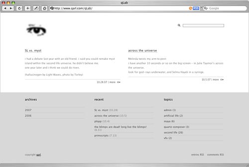
qarl.com/qLab
While writing this post, I've seen a lot of nice minimal blogs completely messed up by the addition of all sorts of photos, animations and embedded video players within the blog. It's of course great if the whole framework looks supremely simple and clean but once you spray the blog posts with all sorts of add-ons you would never have put elsewhere on the site, you haven't come any further.
The simple genius to this site is that when looking at the frontpage, you won't see any excerpt or images from the blog posts, to see them, you have to click your way into the particular posts. This way, the frontpage is kept clean, in style with the design as a whole. And it should be said, the design of this page is a demonstration of well crafted simplicity, I love the horizontal colour split dividing the site. This split also provides a sort of categorisation, acting as a divider between the latest posts in the upper area and the various archive functions in the bottom area. The blinking eye is a bit goofy though.
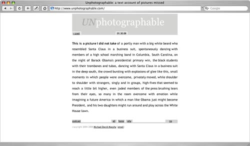
unphotographable.com
Brilliant! I don't think this concept is going to kill off photography any day soon, but what a brilliant, funny idea! Even in a website with such limited content as this one, it would have been easy to smear it with loads of links and graphics that aren't really necessary. The designer of this website has kept it all at a minimum, just a handful of inconspicuos little gray buttons to provide the necessary navigation.
PS: It has been pointed out to me that the genius of this website is not readily apparent to one and all, so I'll include an explanation of what you're actually looking at: this is a photography blog without the photos. Instead of keeping a camera at hand to capture weird or wonderful situations in everyday life, the unphotographer has set up a square box where you'd normally see the photo, and instead filled it to the brim with a written explanation of the scene encountered. The unphotographer is describing what could just as well have been a photo.
www.kottke.org
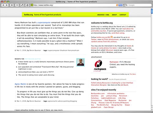
One basic problem when it comes to keeping a website looking light-weight and simple is that when you really want to add a lot of content, such as long posts, images, etc, there will be a conflict. Content equals detail, and you don't really want too much of that floating about the place. The designer of this website has done some smart moves to limit and counteract this issue.
First, I'd like to point your attention to the tiny header. Most blogs will have a big title, often inside a big frame, with swirling colours and stampeding elephants. In this case, you find the title and a slogan of sorts in relatively small letters, but framed in a lime green that despite being quite calm in itself, stands out clearly within a site with no other large continuous areas of colour.
Additionally, the second column (the one to the right) is comparatively small and well structured – other sites often stick truckloads of stuff in there in a seemingly random order. It would have been really cool if the webmaster could convince his advertisers to make ads that fit the design, but I know that's just wishful thinking.
smpl.se
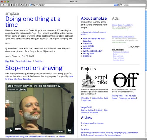
The thing I really like about this site is the clever use of the classic "link blue" colour, utilised even in the headings. Back in the days, most links were this blue colour, but gradually, people started styling away the default link colour. While that is well and good in most cases (since such a strong blue often isn't very suitable), the uncompromising use of a strong blue here makes it supremely easy to tell links and plain text apart.
I'm sure he's not the first person to do this, but in combination with an otherwise very simple, no-frills design, it works particularly well. One detail I notice here is how well the designer has integrated ads into the design. Many designers seem to think that if you place advertising somewhere in the outer fringes of the page, you'll avoid having them mess up the overall design, but the truth is that your eyes will probably make a quick scan of the entire website upon entry.
Here, he has made two columns within the main frame of the left column (a two-in-one solution of sorts) which is again divided horizontally, forming four parts in total, with the adverts within one of these. While clearly labelled as adverts, they still integrate nicely in the overall design, having actually been made an integral part of it.

daringfireball.net
Am I the only one tired of getting my eyes burned out from viewing websites on white backgrounds? The great majority of sites stick to a white background nowadays, I've heard it attributed to white backgrounds making text easier to read. It's an issue that has never bothered me too much, but that might just be due to my own eyesight being relatively good.
This site combines a pleasantly subdued background colour with an utterly readable typeface in a very clean and simple layout. The menu on the left hand side is particularly no-nonsense, clearly separated from other bodies of text, in capital letters that are small enough not to be boisterous but loud enough to make it easy to spot for a new visitor. Wonderful!

plaintxt.org
Not really a blog as such, but rather a provider of some fine wordpress designs, and as such it deserves credit. Not only are the designs presented simple and clean looking pieces, the site they're presented within is built with the same considerations in mind. My impression of this site is that it is very well tailored to it's particular function. It's supposed to showcase wordpress themes, and that's exactly what it does, showing off the various themes very clearly and orderly in the main column. Other things, which requires less space, a menu, small news posts and so on are placed in the smaller column on the right.
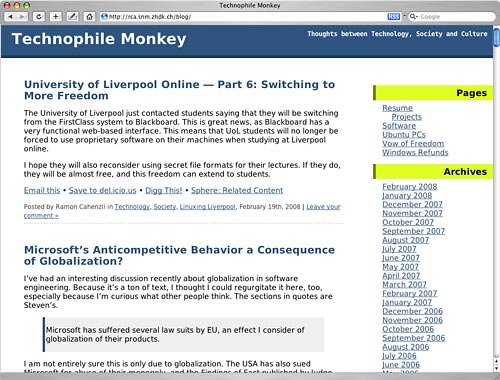
Technophile Monkey
How would it look if webdesign started going retro? I'm sure most of you will agree that ten years ago, the majority of websites looked like shit. This site does indeed look like it could have been designed ten years ago, but it is clearly made of nobler material. Ten years ago, most websites would either contains loads of low-quality photos and animations and look a total mess, or there would just be plain text in a somewhat orderly fashion.
I suppose the difference nowadays is that we have the technology and bandwidth required to make the former category actually look good, while the latter category has shrunk (A LOT). Here's a fine example of an "old-school" design that doesn't look like shit. It's functional, readable, simple and looks quite nice.
Of course, a massive TWO colours could be said to be a bit rich for a minimalist design, but in my opinion, had the two colours been replaced by black or white, it might just have tipped the scales from minimal and interesting to a bit dull. When putting together a minimalist design, that can be a fine line indeed.
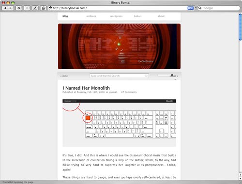
binarybonsai.com
I don't know if it is having HAL9000 staring at you upon entry, or if it's all the fine little layout details, this was just a design that struck me. This layout approach, with a narrow, centred column is particularly nice in my eyes, a fine foundation for a good-looking blog.
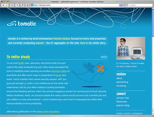
tomatic.com
Deciding on whether or not to include this blog was a tough decision, the jumble at the top and the somewhat juicy colour scheme doesn't make for a perfect fit with my view of a minimalist look. However, I included it because despite the funky look, In its essence, it's a rather simple site without too much fuss.
Creator Thomas Marban has stuck to a single colour (albeit with a bit of a gradient) and has kept the number of links and functions per page low. He also seems to have an eye for choosing suitable illustrations for his postings, something a lot of bloggers don't have. It doesn't matter if the entire blog is perfected in its layout, if every image you add to your posts is completely out of tune with the site's design.

leenutter.com
You'd be hard pressed to strip this down any further without removing essential functions. It's websites like this that really show off the usability advantages a minimalist design has. There are so few irrelevant elements to grab a visitor's attention, the things that actually matter on the site will stand out like the moon in the night sky. Notice that the older the posts are, the darker they appear. Nice one!

Minimalist Weblog
I'll gladly admit that this is not the most stylish of blogs, coming across as rather crude. However, when it comes to building a lightweight, no-frills site, this one beats just about everything else I've seen. Oh wait, it gets better! Check out the old school version of the same blog, and you'll find a blog that is only slightly above Notepad when it comes to extreme simplicity.
I don't expect a lot of similar-looking blogs to pop up any time soon, but I love the fact that even nowadays, with all the bandwidth and computer processing power available, there are those who will stick to pure function, and avoid any hint of bells and whistles. Frank Costanza would approve.
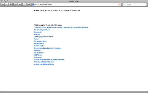
jerrykolber.com
With a setup like this, you have to sacrifice a lot of functions that most web designers and bloggers would be hard pressed to loose. No archive, no datestamps, no RSS, no blogroll, nothing about the blogger except his name.
Minimalism is a lot about balance, keeping the right balance between simplicity and content. While this one could surely be said to be tipped too far towards the simplicity side for most bloggers, it's nevertheless a wonderful little site with nice little posts that take just a few seconds each to read. Navigation is about as easy as it could be, it's not like there's a lot of menus and buttons around to confuse users.
As a bonus, here's a handful of fine websites I've come across that are very much minimalist in tone, but do not fit into the blog theme of this particular post.
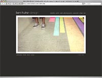
benhulse.com
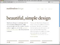
markboultondesign.com
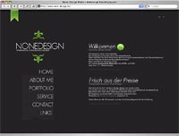
none-design.de
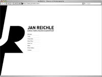
janreichle.com
(This one I particularly like!)
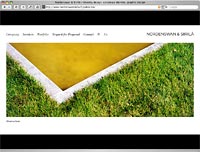
nordenswansiirila.fi
1 comment:
Yes you are absolutely right their are so many website and blogs that looks very messy and the color combination are not good used in their website. But i saw lots of good websites that looks very attractive and i love to stay for long period of time.
Web Design Quote
Post a Comment